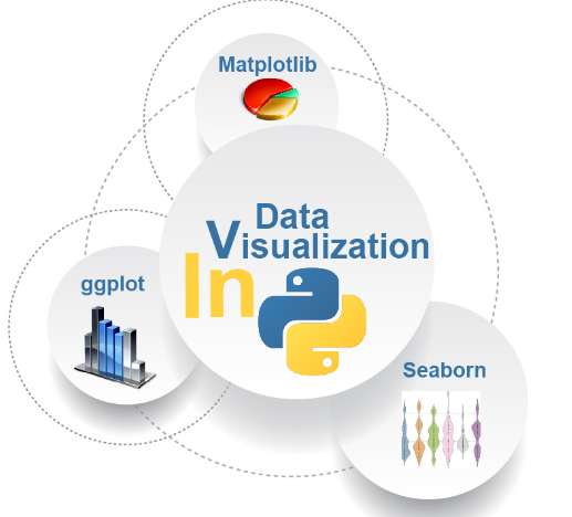
Data visualization is a powerful technique for analyzing and presenting data in a visual format. Python offers several libraries for creating stunning and informative visualizations, with Matplotlib and Seaborn being two of the most popular ones. Let’s explore these libraries:
- Matplotlib:
Matplotlib is a comprehensive data visualization library for Python. It provides a wide range of plotting functions and customization options to create various types of plots, including line plots, scatter plots, bar plots, histograms, pie charts, and more. Key features of Matplotlib include:
- High-level and Low-level APIs: Matplotlib offers both high-level and low-level APIs for creating visualizations. The high-level API provides a simplified interface for quickly creating common plots, while the low-level API gives you fine-grained control over every aspect of the plot.
- Plot Customization: Matplotlib allows you to customize almost every aspect of a plot, such as titles, labels, colors, line styles, markers, gridlines, and legends. You can also add annotations, text, and images to enhance the visual representation.
- Multiple Subplots: Matplotlib supports creating multiple subplots within a single figure, allowing you to visualize multiple datasets or different aspects of the same dataset in a single plot.
- Exporting and Saving: Matplotlib provides functions to save plots in various formats, including PNG, JPEG, PDF, SVG, and more. You can also interact with plots, zoom in/out, and save specific sections of the plot.
- Seaborn:
Seaborn is a statistical data visualization library built on top of Matplotlib. It focuses on creating attractive and informative statistical graphics. Seaborn simplifies the process of creating complex visualizations by providing high-level functions and sensible defaults. Key features of Seaborn include:
- Statistical Plots: Seaborn offers specialized plot types for statistical analysis, such as distribution plots (histograms, kernel density estimation), categorical plots (bar plots, box plots, violin plots), relational plots (scatter plots, line plots), and regression plots.
- Color Palettes and Themes: Seaborn provides a wide range of color palettes for enhancing the aesthetics of your plots. It also offers built-in themes that can be easily applied to change the overall appearance of your visualizations.
- Advanced Visualization Techniques: Seaborn includes advanced visualization techniques, such as heatmap, clustermap, and pairplot, which allow you to explore relationships and patterns in your data.
- Integration with Pandas: Seaborn seamlessly integrates with the Pandas library, making it easy to visualize data directly from Pandas DataFrames. It can automatically handle missing data and perform aggregations when needed.
- Statistical Estimation: Seaborn incorporates statistical estimation and modeling functions to provide insights into your data. For example, it can automatically compute and display confidence intervals around a plot.
Both Matplotlib and Seaborn offer extensive documentation and a wide range of examples to help you get started with data visualization in Python. They can be used together, with Matplotlib providing the underlying plotting capabilities and Seaborn adding a layer of statistical and aesthetic enhancements. Whether you need basic or advanced visualizations, these libraries provide the tools and flexibility to create compelling visuals that convey insights from your data.