
Creating First Re-useable and exportable NavBar through ReactJs.
OVERVIEW
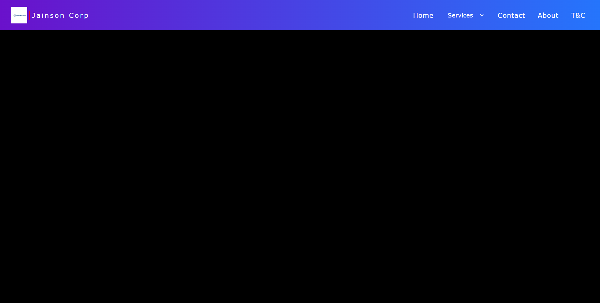
This project is a React-based website aiming to create a responsive and visually appealing navigation bar. The main component, App.jsx, orchestrates the layout comprising site information and page sections. The navigation bar includes a logo, site name, and sections for Home, Contact, About, and T&C. Utilizing SCSS for styling, the design incorporates animations for hover effects, enhancing user interaction. The project provides a foundation for building a dynamic website with a user-friendly navigation system, adaptable to various screen sizes.
Step 1: Setting up the project:
Before we start coding, make sure you have Node.js and npm and Vite installed on your system. Then, create a new React project using create vite@latest by running the following command:
Navigate into the project directory:
Note : Don’t forget to change the package.json “script” field to “start“
Run the following command in the terminal to install SCSS in the project as dependency:
Step 2: Editing Components:
Navigate to App.jsx component.
Open it and copy paste the below code.
-
App.jsx:
Now navigate to App.css and rename it to App.scss .
-
App.scss:
replace any existing code with the following code.
Run the below command in your terminal to start the local server.
CODE EXPLANATION :
1. Importing React and SCSS File:
In App.jsx, React and the SCSS file App.scss are imported.
2. Functional Component:
A functional component named App is defined.
3. Navbar Structure:
Inside the return statement of the App component, there’s a navigation bar (<nav>).
4. Site Information Section:
- A
divwith the classsite-infocontains the site’s logo, a vertical line, and the site’s name. - The logo is an image (
<img>) with the classlogo. - A vertical line is created using a
divwith the classvertical-line. - The site’s name is wrapped in an
h4tag inside adivwith the classsite-name.
5. Page Sections:
- Page sections are defined using
divelements with the classpage-section. - Initially, there are sections for Home, Contact, About, and T&C.
- A commented-out select element provides options for services.
6. Styling with SCSS:
- SCSS (Sassy CSS) is used for styling.
- The
*selector sets box-sizing, padding, and margin to 0. - The
navelement is styled to have a gradient background, specific font, and flex layout. .site-infoand.page-sectionscontrol the layout of their respective sections.
7. Animation:
- A hover effect is applied to
.page-sectionelements using CSS animations. - When hovered over, a red border appears at the bottom of the section.
- Animation is defined using
@keyframes.
8. CSS Variables and Select Styling:
- CSS variables are utilized for colors and sizes.
- Styling for
selectelement is specified. It has a transparent background and white text color. - Inside
select, anyoptionelements would have black text color.
9. Exporting Component:
- The
Appcomponent is exported as the default export.
Conclusion :
This code sets up a basic React component representing a navigation bar. It utilizes SCSS for styling and includes features like a logo, site name, page sections, and a hover animation effect. The code is structured and easily customizable for further development.

