
Creating a Modern Login Page with Dark Mode Toggle in React: A Step-by-Step Guide
Overview:
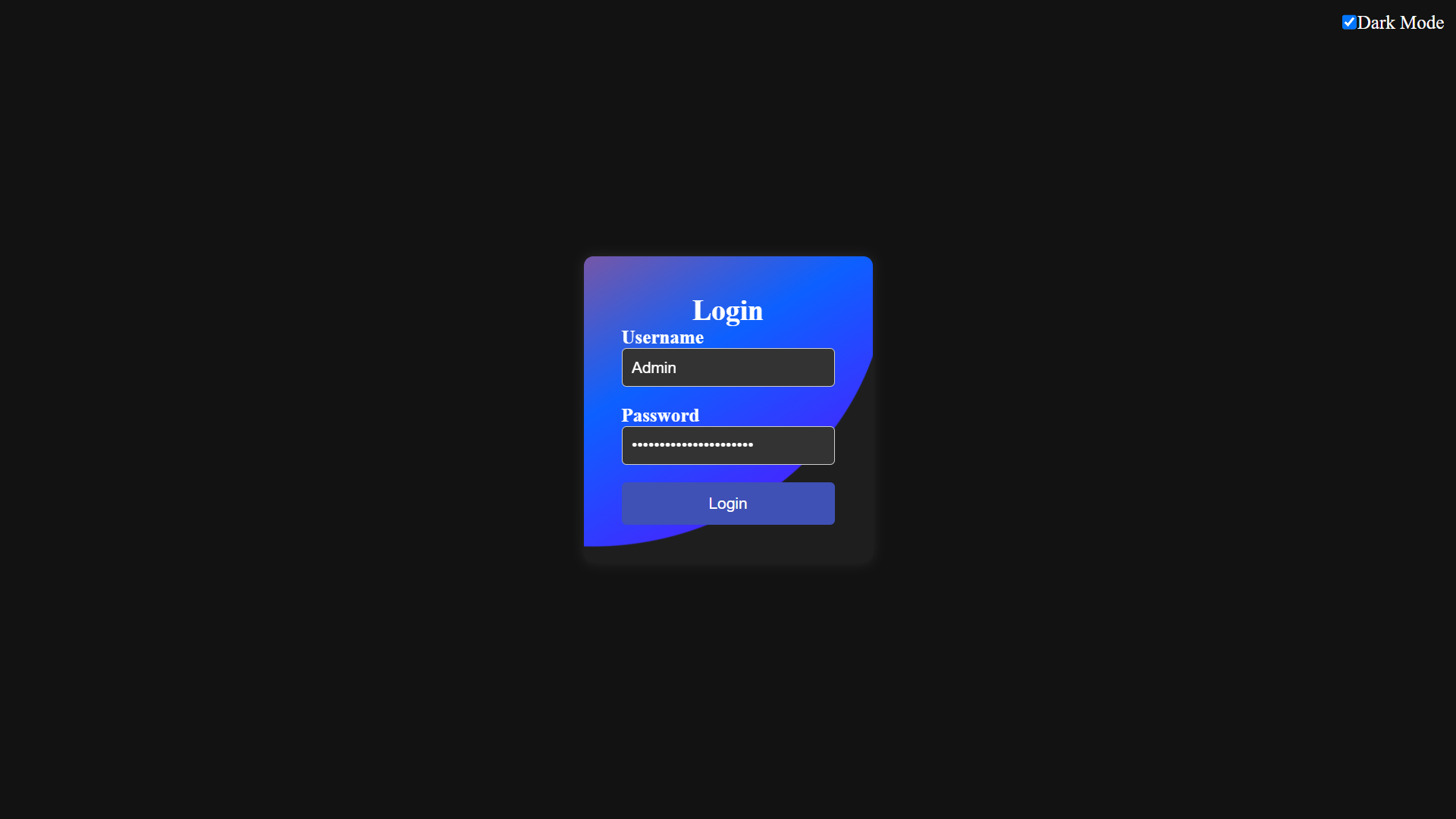
In this tutorial, we’ll create a modern, clean, and responsive login page with a dark mode toggle button using React. We’ll break down the process into several steps and provide a detailed explanation for each step.
Step 1: Setting Up the Project:
Before we start coding, make sure you have Node.js and npm and Vite installed on your system. Then, create a new React project using create vite@latest by running the following command:
Navigate into the project directory:
Note : Don’t forget to change the package.json “script” field to “start”
Step 2: Creating Components:
In our project we will create a Folder named as Components under the src folder.
-
Component Structure:
- We have two components: App and CustomInput.
- App is the main component responsible for rendering the login form and the dark mode toggle button.
- CustomInput is a reusable component for rendering form inputs with labels.
-
App.jsx:
-
CustomInput Component (CustomInput.jsx):
Step 3: Styling the Components:
Next, let’s add styles to our components. Modify the existing file App.css and add the following styles:
-
Code Explanation:
- State Management:
- We use React’s
useStatehook to manage the state of the dark mode toggle button. - The
darkModestate variable tracks whether dark mode is enabled or not. - Clicking on the toggle button toggles the
darkModestate.
- We use React’s
- Styling:
- CSS styles are applied to create a clean and modern UI for the login form.
- The
darkclass is conditionally applied to switch between light and dark modes. - Dark mode changes the background color and text color of the page and the login container.
- Dark Mode Functionality:
- When the dark mode toggle button is clicked, it updates the
darkModestate. - Based on the
darkModestate, the appropriate styles are applied to switch between light and dark modes.
- When the dark mode toggle button is clicked, it updates the
- CustomInput Component:
- This component generates form inputs with labels based on the provided props.
- It receives props like
type,content, andplaceholderto customize the input field.
- Structure Explanation:
- The main
Appcomponent renders the login form and the dark mode toggle button. - The
CustomInputcomponent renders input fields with labels for the username and password.
- The main
- Styling Explanation:
-
- CSS styles define the layout and appearance of the login form and the dark mode toggle button.
- Dark mode styling is applied conditionally based on the
darkModestate.
Functionality Explanation:
- Clicking on the dark mode toggle button toggles the
darkModestate, which in turn updates the UI to switch between light and dark modes.
Step 4: Conclusion:
That’s it! You’ve successfully created a modern login page with a dark mode toggle button in React. This project demonstrates how to create reusable components, manage state, and implement simple styling. You can further customize and enhance this login page according to your requirements. Happy coding!


