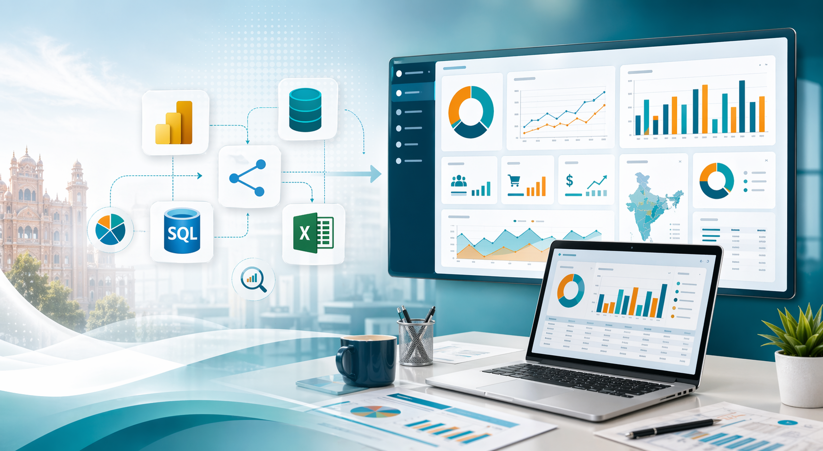
Creating First Re-useable and exportable NavBar through ReactJs.

OVERVIEW


This project is a React-based website aiming to create a responsive and visually appealing navigation bar. The main component, App.jsx, orchestrates the layout comprising site information and page sections. The navigation bar includes a logo, site name, and sections for Home, Contact, About, and T&C. Utilizing SCSS for styling, the design incorporates animations for hover effects, enhancing user interaction. The project provides a foundation for building a dynamic website with a user-friendly navigation system, adaptable to various screen sizes.

Step 1: Setting up the project:

Before we start coding, make sure you have Node.js and npm and Vite installed on your system. Then, create a new React project using create vite@latest by running the following command:

				
					npm create vite@latest nav-component


Navigate into the project directory:

				
					cd nav-component


Note : Don’t forget to change the package.json “script” field to “start

Run the following command in the terminal to install SCSS in the project as dependency:

				
					npm i sass


Step 2: Editing Components:

Navigate to App.jsx component.

Open it and copy paste the below code.

  • App.jsx:

				
					import React from 'react'
import "./App.scss"
const App = () => {
  return (

    <nav className=''>
      <div className="site-info">
        <img decoding="async" className="logo" src="logo.png" alt="" />
        <div className="vertical-line"></div>
        <div className='site-name'>
          <h4>Site Name</h4>
        </div>
      </div>
      <div className="page-sections">
        <div className="page-section">Home</div>
        {/* <div className="page-section" >Services</div> */}
        <select name="Services" id="">

          <option value="" selected>Services</option>
          <option value="">Web Development</option>
          <option value="">Designing</option>
          <option value="">Digital Marketing</option>
        </select>
        <div className="page-section">Contact</div>
        <div className="page-section">About</div>
        <div className="page-section" >T&C</div>
        {/* <div className="page-section"></div> */}
        
      </div>
    </nav>

  )
}

export default App


Now navigate to App.css and rename it to App.scss .

  • App.scss:

replace any existing code with the following code.

				
					*{
  box-sizing: border-box;
  padding: 0;
  margin: 0;
}
nav {
  width: 100vw;
  height: 10vh;
  min-height: 10%;
  max-height: 12%;
  background-image: linear-gradient(to right, #6a11cb 0%, #2575fc 100%);
  font-family: Verdana, Geneva, Tahoma, sans-serif;
  // color: white;
  // color:darkblue;
  color:white;
  display: flex;
  justify-content: space-evenly;
  align-items: center;
  // position: fixed;
  column-gap: calc(50% + 2rem);
  .site-info {
    display: flex;
    justify-content: space-evenly;
    align-items: center;
    // column-gap: 1rem;
    min-height: 10%;
    max-height: 20%;
    height: 50%;

    .logo {
      // position: relative;
      // top:-1rem;
      min-height: 5vh;
      max-height: 8vh;
      min-width: 10%;
      max-width: 20%;
      z-index: 0;
    }
    .vertical-line {
      width: 0;

      border-right: 3px solid red;
      // opacity: 1;
      // height: ;
      // min-height: 100%;
      min-height: calc(100% + 0.5rem);
      max-height: calc(100% + 1rem);
      border-top: none;
      border-left: none;
      border-bottom: none;
    }
    .site-name {
      display: flex;
      justify-content: center;
      align-items: center;
      h4 {
        // padding: 5%;
        letter-spacing: 0.2rem;
        font-weight: 400;
        font-size: calc(0.09rem + 1vw);
      }
    }
  }
  .page-sections {
    
    display: flex;
    font-size: large;
    // justify-content: space-evenly;
    justify-content: baseline;
    align-items: center;
    // text-align: center;
    // height: 100%;
    max-height: 80%;
    column-gap: 2rem;
    width: auto;
    margin-right: 1rem;
    // height: 80%;
    // max-height: 80%;
    max-width: 50%;

    // border: 2px solid black;

    .page-section {
      // border:2px solid black;
      border-top: 0;
      border-left: 0;
      border-right: 0;
      font-weight: 100;
      letter-spacing: 0.05rem;
      // font-size: small;
      font-size: calc(0.09rem + 1vw);
      // padding-right: 1rem;

    }

    .page-section:hover{
      cursor: pointer;
      animation: border-appear-animation 0.2s linear forwards;
      transform-origin: bottom left;
    }
    select{
     background: transparent;
     border: none;
     color: white;
     font-size: calc(0.009% + 1vw);
     font-family: inherit;
     width: 100px;
      max-width: min-content;
    }
    select * {
      color:black;
    }
  }
}

@keyframes border-appear-animation {
  from{
    border-width: 0;
    border-top: 0;
    border-left: 0;
    border-right: 0;
  }
  to{
    border-width: 100%;
    border-top: 0;
    border-left: 0;
    border-right: 0;
    border-bottom: 3px solid red;
  }
}


Run the below command in your terminal to start the local server.

				
					npm start


CODE EXPLANATION :

1. Importing React and SCSS File:

In App.jsx, React and the SCSS file App.scss are imported.

				
					import React from 'react';
import "./App.scss";


2. Functional Component:

A functional component named App is defined.

				
					const App = () => {
  return (
    // JSX content here
  );
}


3. Navbar Structure:

Inside the return statement of the App component, there’s a navigation bar (<nav>).

				
					<nav className=''>
  {/* Navbar content here */}
</nav>


4. Site Information Section:

  • A div with the class site-info contains the site’s logo, a vertical line, and the site’s name.
  • The logo is an image (<img>) with the class logo.
  • A vertical line is created using a div with the class vertical-line.
  • The site’s name is wrapped in an h4 tag inside a div with the class site-name.
				
					<div className="site-info">
  <img decoding="async" className="logo" src="logo.png" alt="" />
  <div className="vertical-line"></div>
  <div className='site-name'>
    <h4>Site Name</h4>
  </div>
</div>


5. Page Sections:

  • Page sections are defined using div elements with the class page-section.
  • Initially, there are sections for Home, Contact, About, and T&C.
  • A commented-out select element provides options for services.
				
					<div className="page-sections">
  <div className="page-section">Home</div>
  {/* <div className="page-section">Services</div> */}
  <select name="Services" id="">
    {/* Options for services */}
  </select>
  <div className="page-section">Contact</div>
  <div className="page-section">About</div>
  <div className="page-section">T&C</div>
</div>


6. Styling with SCSS:

  • SCSS (Sassy CSS) is used for styling.
  • The * selector sets box-sizing, padding, and margin to 0.
  • The nav element is styled to have a gradient background, specific font, and flex layout.
  • .site-info and .page-sections control the layout of their respective sections.

7. Animation:

  • A hover effect is applied to .page-section elements using CSS animations.
  • When hovered over, a red border appears at the bottom of the section.
  • Animation is defined using @keyframes.

8. CSS Variables and Select Styling:

  • CSS variables are utilized for colors and sizes.
  • Styling for select element is specified. It has a transparent background and white text color.
  • Inside select, any option elements would have black text color.

9. Exporting Component:

  • The App component is exported as the default export.
				
					export default App;


Conclusion :

This code sets up a basic React component representing a navigation bar. It utilizes SCSS for styling and includes features like a logo, site name, page sections, and a hover animation effect. The code is structured and easily customizable for further development.